We need a new Logo!

Jman423

Administrator
Mar 24, 2014
1,874
United States
CaptainXL said:
Sorry for bringing it up. Never crossed my mind that decals were ordered.

No need to be sorry, discussion is good, it's a forum.

MAY03LT said:
9d64b26b.jpg


I like this a lot!!!!

If you really want to drive the idea home, you should have incorporated an ad into the logo too!

davenay67 said:
The logo is good. In my mind, what is making it look plain is the fact that it only occupies 10% of the banner, with the remaining 90% being a pale blue gradual-fade.

The logo should either take more prominance in the banner area, or more content should be added. Photos of owners truck is a good idea. Anything to add content to the banner without looking cluttered or distracting from the logo itself.

Out of curiousity, who was the designer of the logo..??


Dave.
wootown22 said:
I like the logo!

But, I would also like to see some life added to the header. Here is just an idea, like what was stated before; integrating a contest winner photo into it.

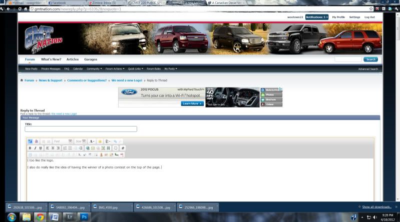
And the other, with a vehicle from all the platforms (I glanced and did the few most common ones. If we went this route we should have a contest for each platform; change it twice a year?) i just quickly grabbed the ones other than my own from google.

just ideas :smile:

header1.jpg


version2.jpg


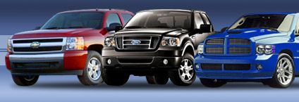
or a classic lineup like these with some of the vehicles on the right side:
right.jpg

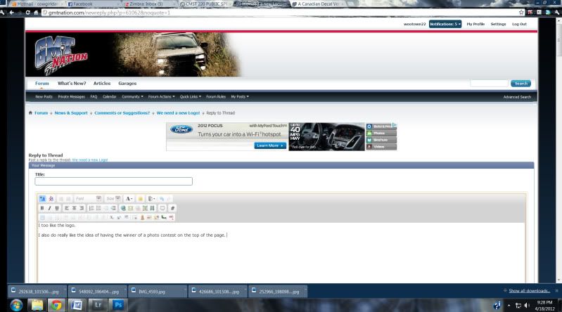
The idea that you two have mentioned has been a nagging thorn in my side, and that thorn is named Ghoster. I want to fill that area at the top of the site, but it is not easy to keep it looking clean. As you can see from screenshots in this thread, some people have tons of space up there, and others don't. It depends on the style you choose, and the horizontal space on your monitor... which the fluid theme will automatically size-to-fit. I haven't had much time to work on this lately due to personal and work reasons, but it was something I was messing with for a little while and never found the happy medium.

The logo was designed by a member here, and we are VERY happy with it. It is the face of our community, and I don't see it changing majorly any time soon.
 

harmless

Member
Nov 21, 2011
2,049
IMHO, the logo is fine. Keep it.

We can make enough variations on it when it comes to decals and shirts.

I think what we need is something to fill that big white space beside it.

Aside from parking ads in there... My eyes are finally clearing from all that eyebleach I had to use after the last VerticalScope debacle. :rotfl:
 

Voymom

Member
Feb 3, 2012
2,523
I have a big blank space up top, aside from the occasional ad. Honestly, I like the 1st picture wootown did as well. Don't get me wrong, I love the site..but sometimes it's just to plain :redface:
 

TexazReece

Member
Dec 4, 2011
1,341
07 TB RIDER said:
You could do it like Tony's site like others have suggested. It'd be kinda cool.

header_banner_new-Copy1.jpg

I saw this a lil late but I was ROTFL when i saw this.......nice way of getting your truck in the truck of the month :cool:

I love the logo don't change it but I like wootown's idea
 

Voymom

Member
Feb 3, 2012
2,523
I like both idea's.....

Wootown's idea can maybe be incorporated into a truck of the month?

I wanna be truck of the month!!! :biggrin:
 

ItsOnVoy

Member
Nov 21, 2011
2,401
I like the second one she did! :yes:
 

OctaneRider03

Member
Jul 31, 2012
430
I was thinking lastnight, what's something bold enough that stands up and screams "screw you Trailvoy!" loud and clear, if that's even the route the staff wants to go with GMT, and at the same time says we're bigger, we're better and we don't need justification for anything because we stand for the folks that are truly genuine about their ride..

So then I thought, wait a minute.. Genuine.. General Motors TRIES to exemplify genuine in all they do. Or at least we'd like to believe they do. I then went out back and looked into the garage at my Trailblazer. After looking all the way around it, it hit me like a bag of bricks. The Trailblazer logo on the back. There was something about it. The font maybe? Now, I'm not talking about the older model Trailblazer logo's that have the plastic seal around it with the letters slanted towards the right, I'm talking about the newer model logo's, the ones with chrome individual lettering that are spaced out enough dispersion wise, and sit straight up and down. They use this style of "font" if you will on all (or most) newer GM vehicals. When I see this style lettering on some of the newer Chevy/GMC models, the first thing that comes to my mind is pure, unconditional perfection with a product that was built to last through thick and thin and, is truly GENUINE.

So then I thought about Trailvoy for a second and then looked back over at GMT Nation. You guys started this forum from the ground up, I.E., you took all the good you saw in previous forums in the past and completely revitalized the meaning of dedication for those people out there that were looking for a good place to come to for advice and guidance. You've established yourselves here, and done an amazing job at this. Now all you need is a face lift. A fine line of seperation from the old and new.

Back to my Trailblazer. The letters on the back of my truck that spell out the word "Trailblazer", I've seen them on so many newer makes and models. Those letters signify to me that fine line of seperation I was talking about. The difference between old school and new school. I say you try to incorporate that same lettering font into GMT Nation. I say you make the border/background behind the logo completely black, then close to the bottom centered off, you evenly disperse that font across the header (or across the center top), and somewhere in there you include a picture that almost appears faded behind the lettering, of many different GM makes and models all lined up, and then to top it off, you incorporate something I saw on The Roadies thread posts, and that is, GMT Nation Abides.

You have perfection my friends.

Now I'm not a photoshop guy by any means, but to any of you put there that can see my vision, I think it would be awesome for the page and the community. I think we should have an aggressive look, something that doesn't scare new joiners off obviously, but that looks good, smooth, bold, and original.

This is my take on a new logo. -Lee
 

ItsOnVoy

Member
Nov 21, 2011
2,401
I would just like to see the top filled out and has something there, its too boring IMO. Truck of the month, week whatever, multiple trucks or something would be cool. But that is one opinion
 

Forum Statistics

Threads
23,273
Posts
637,499
Members
18,472
Latest member
MissCrutcher

Members Online

No members online now.