Need help on Logo Decision.

TrailBlazer13

Original poster
Member
Mar 23, 2014
63
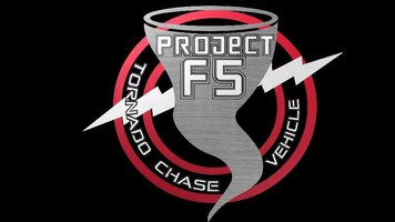
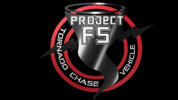
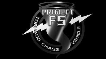
As many of you know i am an avid Storm Chaser. My Trailblazer is being turned into a Tornado Chase Vehicle slowly. I am starting up a youtube channel as well as getting some merchendise created. I need your help I have 3 Logos to choose from if you could please give me your Two Cents.
Thank you for the help. also if your a storm chaser let me know always looking to make connections.
 

Attachments

  • logo1.jpg
    logo1.jpg
    43.7 KB · Views: 22
  • logo2.jpg
    logo2.jpg
    37.5 KB · Views: 21
  • logo3.jpg
    logo3.jpg
    34.8 KB · Views: 23

djthumper

Administrator
Nov 20, 2011
14,950
North Las Vegas
The second with a different color lightening bolt, Even white will make it pop better.
 
  • Like
Reactions: Mounce

Grimor

Member
Mar 28, 2013
954
they all look like they will turn into a blob at small size. Some things I've always tried to keep in mind doing logos;

how will it look printed in B&W, 3 color, or 4 color
how will it look without half-tones or dithering
how will it look at 1"x1", 1'x1', and 10'x10'
Can it be embroidered
Is the font generally available or commercial
Is the text "text" or will it have to be rendered
 

TimRXUV777

Member
May 6, 2014
189
I have done quite a bit of graphic design work in the engineering field. I would recommend making sure the unique elements in the logo are shades or tints enough different to make them easily distinguishable. I don't think you've succeeded fully in any of them in that regard. I would also say that the second or third logo accomplishes it probably the best. I like the shading in the funnel of the second but it should probably be circular to suggest the 3d dimensions that you can't show in 2d. I would suggest lightening up the funnel and maybe using white circular fill to imply the circular motion of the funnel. I would also change, as has been suggested earlier, the color of the lightning bolt if you do use the second example. I am also not sure about how you are showing the top of the funnel.. it could probably be simplified? Also the typefaces don't seem to relate well to the words but if you like them keep them as is.
 

Forum Statistics

Threads
23,271
Posts
637,476
Members
18,472
Latest member
MissCrutcher

Members Online